


+20 years bundled in kickass courses.
Hi, I'm Nef. Award-winning creative director & Awwwards instructor
The Problem
The problem today is the lack of context most design courses provide. Typically they offer chunks of information but leave you dry and cold without understanding the entire process from start to finish.
My Solution
All my courses follow a linear path for beginners and professionals including UX strategy, user-interface design, no-code web development, storytelling with video and finally bringing more customers with simple online marketing.
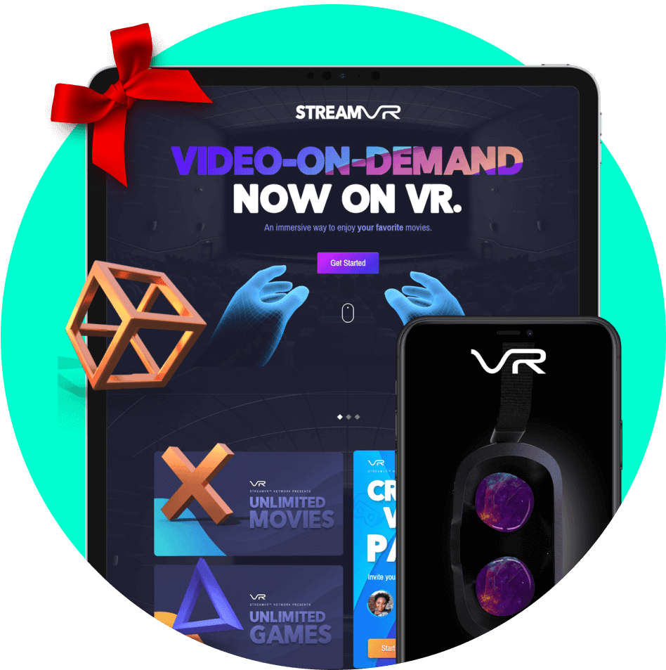
What are we building?
In this Masterclass, you'll join award-winning creative director Neftali to design & build a virtual reality streaming platform. An exciting project filled with visual components, interactions, animations and dynamic data from start to finish.
Who should enroll?


IT Students or Professionals including Designers, Engineers, Art Directors, Marketers, Content Creators or Entrepreneurs looking to learn the complete process of creating visual experiences with modern technology. If you are looking to grow your skills in any of these roles, this Masterclass is the key to opening those doors.
TestimonialsTestimonials
What students are saying... 💜


It has been the best investment I made in my design journey so far. I would consider myself a novice, but I honestly feel like I've gained a genuine professional insight into the process of creating a high-level website.

I'm an early adopter of the KreativePro Masterclass, and I love how well put together it is. Neftali takes you through each step of the process from paper sketches to marketing all with fun visuals & clear instructions!


This course changed my life! I've been wanting to learn Webflow. Neftali is a super knowledgeable instructor, and has created a rich and intuitive course.

Courses
Unlimited access to +20hrs of video
.png)

.png)
.png)
.png)
